


Photo Collage Maker: SCRL
Appostrophe AB
I first noticed Photo Collage Maker: SCRL because it solves a very specific Instagram problem: fitting several photos into one polished post without forcing each image into a separate upload. After spending time with it as a photography app, I found that its real appeal is not simply making collages. It is the way it helps you plan a visual sequence, especially when you want a carousel to feel like one continuous piece rather than a stack of unrelated pictures.
That distinction matters. A basic collage tool is usually about squeezing images into a grid. SCRL is more useful when the story between the images matters. You can work toward a wide, scrolling composition, arrange a carousel with a clear visual rhythm, or build a single post around a travel view, outfit sequence, product selection, event recap, or collection of personal photographs. I would recommend it to anyone who thinks about how an Instagram post looks as a whole, not just how each individual picture looks.
The app is free to download, with optional in-app purchases ranging from $4.99 to $49.99 per item. It comes from Appostrophe AB, carries an Everyone age rating, and has reached over 10 million installs with a 4.5 average from around 313 thousand ratings. Those figures suggest that it has become a familiar choice for people who want more control over social photo layouts, but popularity does not remove the need to understand its workflow and limitations.
Where SCRL fits into a real mobile photography routine
SCRL feels most valuable before publishing, when I am still deciding how a group of photos should work together. Instead of opening Instagram and trying to improvise a carousel inside the posting screen, I can prepare the visual structure separately. That makes it easier to notice when two photos are too similar, when a transition feels abrupt, or when the first image does not give the rest of the set enough context.
A realistic example is a weekend trip. I might have a wide street scene, a close-up of a café table, a portrait, and a detail from a building. Posted individually, these images may look disconnected. In SCRL, I can arrange them so the viewer moves from the broad scene to the smaller details. A carefully placed edge, color, or subject can lead the eye into the next image. The result feels more like a visual walk than a random photo dump.
Latest News

Uber Eats Under Pressure: What Happens When Delivery Goes Wrong

How QR & Barcode Scanner Adapts to Android and iOS Innovations

Why Waze Navigation & Live Traffic Is Your Essential Travel Companion
CapCut Mastery: Unleash Hidden Features for Pro-Level Editing

How OS Updates Enhance Roblox Adventures

Teacher Simulator: Exam Time Turns Quick Classroom Judgments into a Repetitive Loop
The same approach works for a small business owner preparing a product carousel. Rather than placing one product in each identical square, I can use the first frame to establish the collection, follow with detail shots, and finish with a wider arrangement. That does not replace a full design program, but it is quicker than building every page from scratch on a laptop. For a phone-first workflow, that balance is one of the app’s strongest qualities.
It is also useful for people who like a tidy personal feed but do not want every post to look identical. A continuous layout can make a set of ordinary images feel more intentional, while a simpler carousel can preserve the natural character of the photographs. I would not use the same template for every post. The app works better when the layout follows the material rather than becoming a visual habit.
Why the scrolling approach changes the result
The most important creative idea here is the scrolling canvas. A normal collage divides the available space into obvious boxes, which can make every photo feel isolated. A scroll layout gives me room to think horizontally, so a subject can begin in one frame and continue into the next. This is particularly effective with landscapes, architecture, fashion details, and long tables or displays.
Gallery
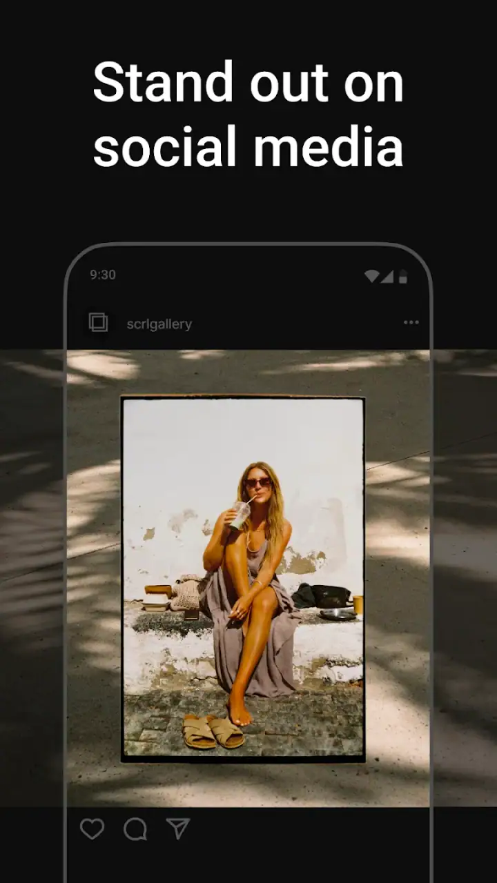
There is a trade-off, though. A design that looks elegant while I am editing may feel less dramatic once it is divided into carousel panels. I have to check the boundaries carefully. Faces, text, hands, and important objects should not land awkwardly at a cut. This is one of the less obvious skills involved in using SCRL: the best-looking canvas is not automatically the best-looking carousel. I need to preview the sequence as a viewer would see it, one swipe at a time.
For that reason, I find it helpful to place the main subject slightly away from a panel edge, then use the surrounding space to create movement. If a photo has a person looking toward the right, I can position it so that the gaze leads into the next panel. If the subject fills the frame, I may choose a less ambitious layout instead of forcing a transition that makes the image feel cramped.
This is also where the app differs from the usual quick collage makers. Many alternatives are designed around grids, borders, and immediate export. SCRL is more concerned with the relationship between images. That makes it more expressive, but it also asks for more decisions. Someone who only wants four photos in equal squares may find a simpler collage app faster.
Working on a phone without losing control
Editing on a phone is convenient, but it can make precision difficult. Small handles, narrow gaps, and crowded compositions are harder to judge on a compact screen than on a desktop monitor. I found that the most reliable workflow is to start with the photos in the order I think they belong, then make broad structural choices before adjusting individual positions. Moving everything repeatedly can become frustrating when the overall direction is not settled.
For a mobile session, I would first choose the strongest opening image. The first panel has to work on its own because not everyone will swipe. After that, I would arrange the supporting images according to a simple sequence: wide to close, exterior to interior, overview to detail, or beginning to result. This prevents the editing process from turning into endless decoration.
SCRL is especially handy when I am away from my usual computer. I can prepare a post from a train seat, a café, or a hotel room, provided the images and the parts of the workflow I need are available at that moment. The phone format keeps the process approachable, but I still prefer to do a final visual check on a larger screen when the design contains small text or many overlapping elements.
That preference is not a criticism of the app so much as a reminder of its purpose. This is a mobile photography tool, not a replacement for a full desktop layout suite. It gives me a faster route to a finished social post, while a professional design program remains better for complex typography, exact brand systems, detailed retouching, or work that must be reproduced across several formats.
Connectivity becomes part of the experience
The network matters most at the points where I move between the app, my photo library, and a social platform. A weak connection can make a carefully prepared mobile workflow feel uncertain, particularly when I am trying to gather images from cloud storage or continue toward publishing. I do not treat a finished design as published until I have checked that the export or sharing step has completed properly.
This is why I prefer to prepare important posts before the moment they are needed. If I am covering an event or planning a product announcement, I would not wait until the busiest part of the day to select images, build the layout, and send it onward. A stronger approach is to create the composition earlier, inspect the carousel sequence, and leave only the final selection or caption for later.
Connectivity also changes how spontaneous the app feels. When everything loads smoothly, SCRL supports a quick idea: select a few images, test a layout, and move on. When the network is unreliable, I become more cautious about depending on remote content or assuming that a handoff to another service has worked. I value the app most as a preparation tool, where I can take time to verify each stage rather than rushing through a connection-sensitive moment.
For data-conscious users, the practical lesson is simple: use a stable connection when importing or transferring large groups of photographs, and avoid treating mobile data as unlimited just because the editor itself feels lightweight. High-resolution images can make a session more demanding than the interface suggests. I also prefer to keep my source selection focused instead of repeatedly browsing an entire library while connected through a limited plan.
The app’s current version is 1.14.4 and it runs on Android 7.0 or later. That broad compatibility is useful for people who keep an older phone as a secondary camera or editing device. Still, the experience can vary with screen size, storage space, camera output, and network quality. A newer phone may make dragging and previewing more comfortable, while an older device may encourage a simpler layout with fewer images.
What happens when a workflow goes wrong
My main advice is to treat each finished design as a project that deserves a quick recovery plan. Before leaving the editor, I would check the order, inspect every panel boundary, and make sure the intended images are actually in place. This is more valuable than adding another decorative element. A beautiful layout with one misplaced photo is still a failed post.
When a transfer or sharing step does not behave as expected, I would avoid immediately rebuilding the composition. First, I would confirm whether the image was exported or handed over successfully, then return to the saved work if it is available. Recreating a long scrolling design from memory is exactly the kind of avoidable effort that makes mobile editing feel worse than it needs to be.
I also recommend keeping the original photographs untouched. SCRL is a layout stage, so the source images should remain available if I later decide that a different crop, order, or sequence works better. This is particularly important for a carousel: an image that seems secondary in one arrangement may become the bridge between two other images in another.
There is a creative recovery technique I use when a layout feels crowded: remove one photograph rather than shrinking everything. Fewer images often improve the rhythm and reduce the risk of awkward cuts. The app makes it tempting to fill every available space, but a blank area can give the viewer a pause and make the next image more noticeable.
Another useful fallback is to keep a simpler version of the idea. If the wide scroll arrangement becomes difficult to read, I can switch to a cleaner sequence with stronger individual frames. That is a better solution than preserving a clever transition that only makes sense while editing. The best design is the one the audience understands without needing an explanation.
Free access, optional purchases, and who should use it
The free entry point makes it easy to test whether this style of editing suits me before spending anything. I would begin by recreating a small post from images already on my phone. If I enjoy arranging the sequence and checking how the panels connect, the app has probably earned a place in my toolkit. If I only want a quick border and instant sharing, I would stop there and use a simpler option.
Optional purchases between $4.99 and $49.99 per item mean that the cost can become part of the decision. I would not pay simply because a template looks attractive. I would first decide whether the paid material fits a repeated need, such as maintaining a recognizable visual style for a portfolio or a small shop. For occasional personal posts, the free experience may be enough, depending on which creative tools are available during use.
The app is a strong match for Instagram-focused photographers, creators who build stories from several images, small sellers preparing product groups, and anyone who finds standard square grids too restrictive. It is also useful for beginners who want more visual structure without learning a complete desktop design application.
I would skip it if my priority is advanced photo correction, batch processing, detailed typography, or output for print. SCRL can help arrange photographs, but it is not the tool I would choose for color-managed production, elaborate brand guidelines, or a large campaign requiring many precisely matched formats. In those cases, a full design or editing suite is the better investment.
My practical method for making better carousels
I get more consistent results when I separate editing into three passes. First comes selection: I remove near-duplicates and keep only images that contribute something different. Second comes narrative order: I decide what the viewer should understand after the first swipe, then after the next. Third comes styling: only after the sequence works do I adjust spacing, overlaps, and visual accents.
This method prevents one of the common mistakes in collage apps, which is allowing a decorative template to dictate the story. SCRL is at its best when the photographs lead and the layout supports them. A travel carousel may need breathing room, while a product sequence may benefit from a tighter arrangement. The same canvas style should not be forced onto both.
I would also check the post in two ways. First, I would inspect the full design to judge balance and continuity. Then I would review each carousel panel by itself, because the audience experiences the post as separate moments. If the first panel looks finished but the second feels like an accidental crop, the overall concept needs revision.
For people who publish regularly, creating a small personal set of rules can save time. I might decide that the opening frame always contains one clear subject, that text never sits on a busy edge, or that the final frame gives the sequence a sense of completion. These rules are not limitations; they make the next SCRL project easier to start and easier to correct.
My connectivity verdict after using it
SCRL earns my recommendation because it gives mobile photographers a way to think beyond isolated images. Its scrolling layouts and carousel-focused workflow make it more purposeful than a basic grid maker, while its phone-first approach keeps the process accessible. I especially like it for planned posts where the order, movement, and relationship between photographs matter.
The network side of the experience deserves realistic expectations. I would prepare important work ahead of time, keep source images organized, and verify every export or sharing handoff rather than assuming a successful-looking tap means the job is finished. That habit makes the app feel much more dependable in travel, event, and business situations.
Released on February 20, 2024, and developed by Appostrophe AB, it has a clear identity within photography: not a general editor trying to do everything, but a focused tool for turning several pictures into one social presentation. Its Everyone rating also makes it approachable for a broad audience, although the quality of the result still depends heavily on the choices made by the person editing.
My final recommendation is straightforward: try it if you want your Instagram carousels to feel connected rather than merely grouped together. Give it a pass if you need deep retouching, print-ready design, or the fastest possible one-tap collage. For everyone in between, especially people who enjoy shaping a visual sequence on a phone, this free photography app is worth exploring before deciding whether its optional purchases add enough value to your routine.
FAQs for Photo Collage Maker: SCRL
What features does Photo Collage Maker: SCRL offer?
Photo Collage Maker: SCRL provides a range of features including customizable templates, drag-and-drop functionality, and advanced editing tools. Users can create stunning collages with various layouts, add text, stickers, and filters, and even adjust the aspect ratio to fit different social media platforms. It’s designed for both beginners and advanced users.
Is Photo Collage Maker: SCRL free to use?
Photo Collage Maker: SCRL offers a free version with basic features. However, to access premium templates, additional editing tools, and an ad-free experience, users can subscribe to a paid plan. The subscription is available on a monthly or annual basis, offering more flexibility and creative options.
Can I share my collages directly from SCRL to social media?
Yes, Photo Collage Maker: SCRL allows users to share their creations directly to various social media platforms. Once your collage is complete, you can easily export and post it to Instagram, Facebook, or Twitter. The app simplifies the process, ensuring your images are perfectly sized for each platform.
Does SCRL support high-resolution exports?
SCRL supports high-resolution exports, ensuring that your collages maintain their quality when printed or shared digitally. This feature is particularly useful for professional users who require crisp, clear images for portfolios, presentations, or personal projects. Users can select the desired resolution before exporting.
Is Photo Collage Maker: SCRL suitable for beginners?
Photo Collage Maker: SCRL is designed with a user-friendly interface that caters to both beginners and experienced users. It offers intuitive tools and easy-to-follow instructions, allowing newcomers to create beautiful collages without a steep learning curve. Advanced users will appreciate the app’s extensive customization options.
Pros
- Easy to use interface for quick edits.
- Wide variety of templates available.
- High-resolution export options.
- Seamless integration with social media.
- Regular updates with new features.
Cons
- Limited free features; premium needed.
- Occasional ads can disrupt workflow.
- Requires internet for full functionality.
- Some templates lack customization.
- App size can be quite large.


